Image Credit: Jon Tyson
Wow! Has it really been a year since I last wrote a blog? I guess life really does get busy once you are working full time outside of the home, as well as doing the Mom thing, and the freelancer thing. But if you take the time to look at the subhead under my blog’s name you will see the words “The Whenever I Feel Like It…” so at least I am not letting any of my readers down, everyone who does read my blog should know, that this is not something I do on a regular basis. In this blog I am briefly going to cover the past 12 months of graphic design/art… or at least the stuff that I feel is worth writing about.
Pantone 2020

Photo Credit: Square Bubble Design
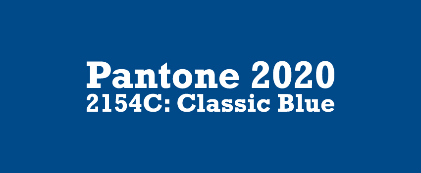
I usually am reliable on one topic, a January blog post on my thoughts for their pick for color of the year. This is the first time, in a long time, that I have to say that I actually like their choice. First of all, it has been a long time since they chose a shade of blue, and second of all, they actually picked a color that could easily trend.
Last year, they picked a shade of corral, which I thought was a mistake. The stores responded by bringing all their corral items to the front of the store to advertise that they had that year’s color for sale; however, as I predicted, the color never really trended past the initial “color of the year” news release.
In the year 2020, they chose wisely. Not only will “Classic Blue” always be popular, simply because blue is the most popular color in the world (source). Classic Blue unlike 2016’s blue (Serenity), is bright, bold, beautiful, and timeless.
Adobe's New Icons

Above image was found on Google and then edited by SBD to fit the format of this website.
Square Bubble Design does NOT claim ownership of this image.
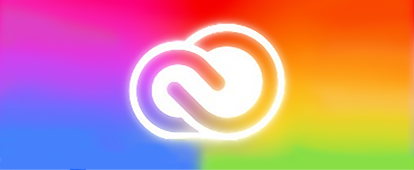
Adobe CC has decided to update their icons. Part of this update included changing the colors of all the icons so that they are now color coded. For example: Lightroom and Photoshop are now the same shade of blue, and Premiere and After Effects are the same shade of indigo/purple; other apps all seem to have their own colors. The purpose behind this was to help designers find the apps they are looking for by grouping the software that works well together (i.e. Lightroom and Photoshop both edit digital photos) together.
The reviews on the change are mixed, with some loving the new organization, and others thinking that the app logos now are too similar. Since I usually only work with six of the Adobe CC apps, this change does not affect me much; only two of those apps are now the same color, and I can tell them apart fairly easily and therefore I do not mind the change. My only complaint is that the green scheme that used to be Dreamweaver now belongs to Dimensions, and that causes me to open Dimensions when I want Dreamweaver; which is not a big deal, it’s just annoying. Also, if I expand what I do use in the future, I will be able to tell what apps work with what with a simple glance, and for me, that is a good thing.
Coming Soon from Square Bubble Design

Photo Credit: Square Bubble Design
I have been working on a new font. This new font is based on the same science as Open Dyslexic, but has a less “elementary school” look and vibe. The current working name is Heavy Bottoms and it is a serif font with, you guessed it heavy bottoms.
It is my hope that this could help people with dyslexia read more easily. Open Dyslexic is a great font and I am a huge fan of it, but I cannot use it in my design work outside of an elementary school setting. My goal with Heavy Bottoms is to make it more usable across the board, so that, as stated before, people with dyslexia will have an easier time reading, while having a font that looks more professional.
Once I complete this font, I will have it available for free download (for personal use only) on this site! Stay tuned to this blog to get your copy.
Side Note: Above is a small sample of the font, if you have a better name for it than Heavy Bottoms, I would love to hear your idea! Send me an email and tell me all about it!
Final Thoughts for This Blog
I do pay attention to design/art news, but with all this covid cr*p and civil unrest, I just do not find anything else that has happened in this category noteworthy… apart from the destruction of statues… but since the statue destruction falls into the “political” category, I am going to refrain from speaking on this issue, because this blog, website, and designer vows to stay publicly neutral. If I feel it is needed to post my opinions on topics of a political nature, I will, but for now, that is not going to happen.
Back to Main Blog Page